AVERTO
KEEPING COMMUNITIES SAFE
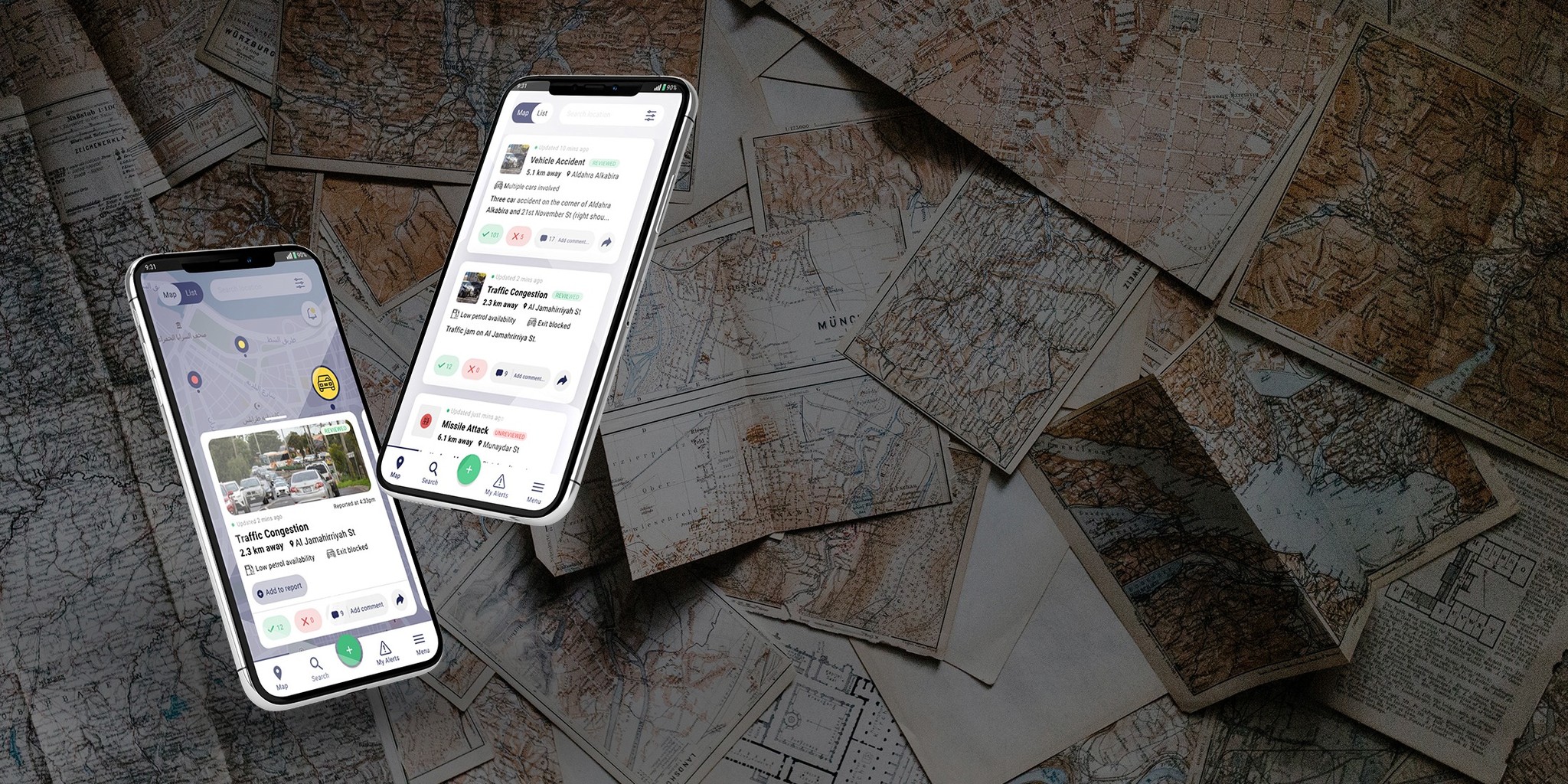
This case study features a crowd-sourced, situational awareness mapping app, which was originally based in Libya. The Averto team asked us to design UI/UX mockups and wireframes of their new, cross-platform ecosystem, which will include a new user reporting process and new features.
Client
Android, iOS
Services
Miro, Figma, PhotoShop
Industries
User Research, UX/UI Design, Product Design
Date
Karl Solano, Keegan Brown, Chris McCabe
THE CONTEXT
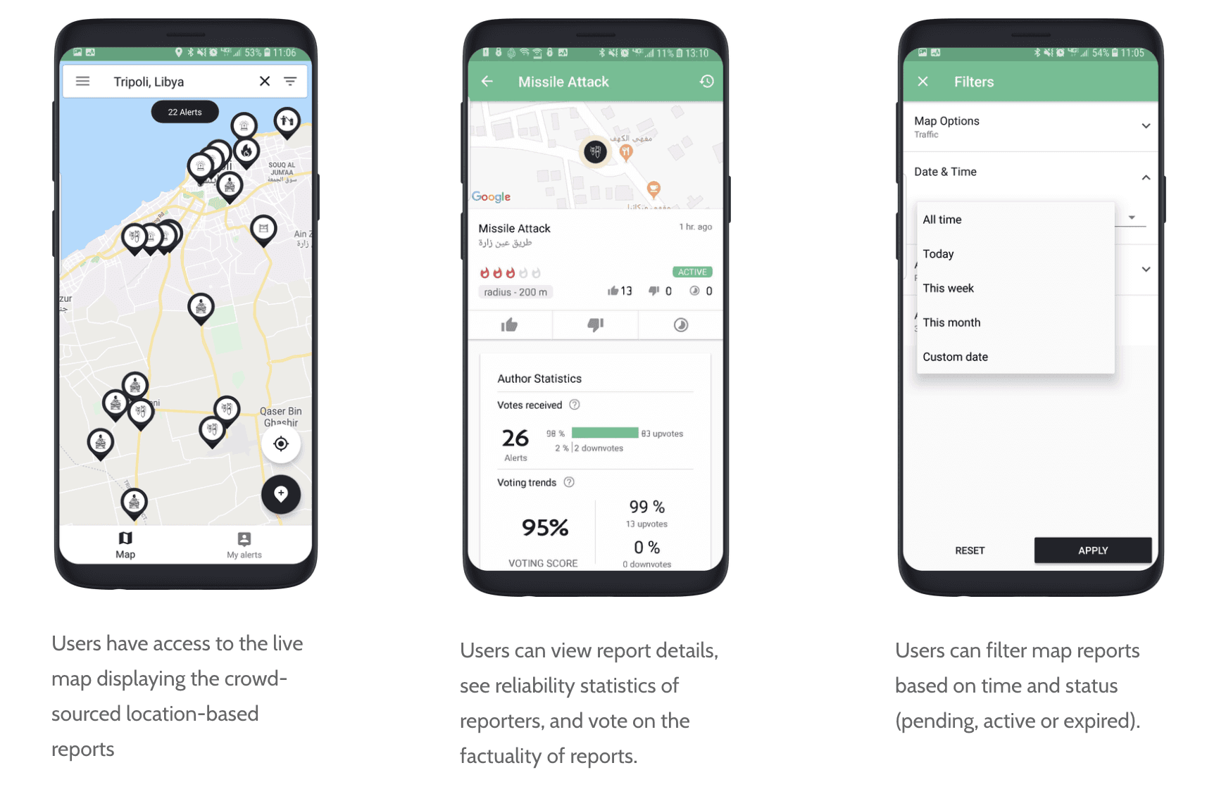
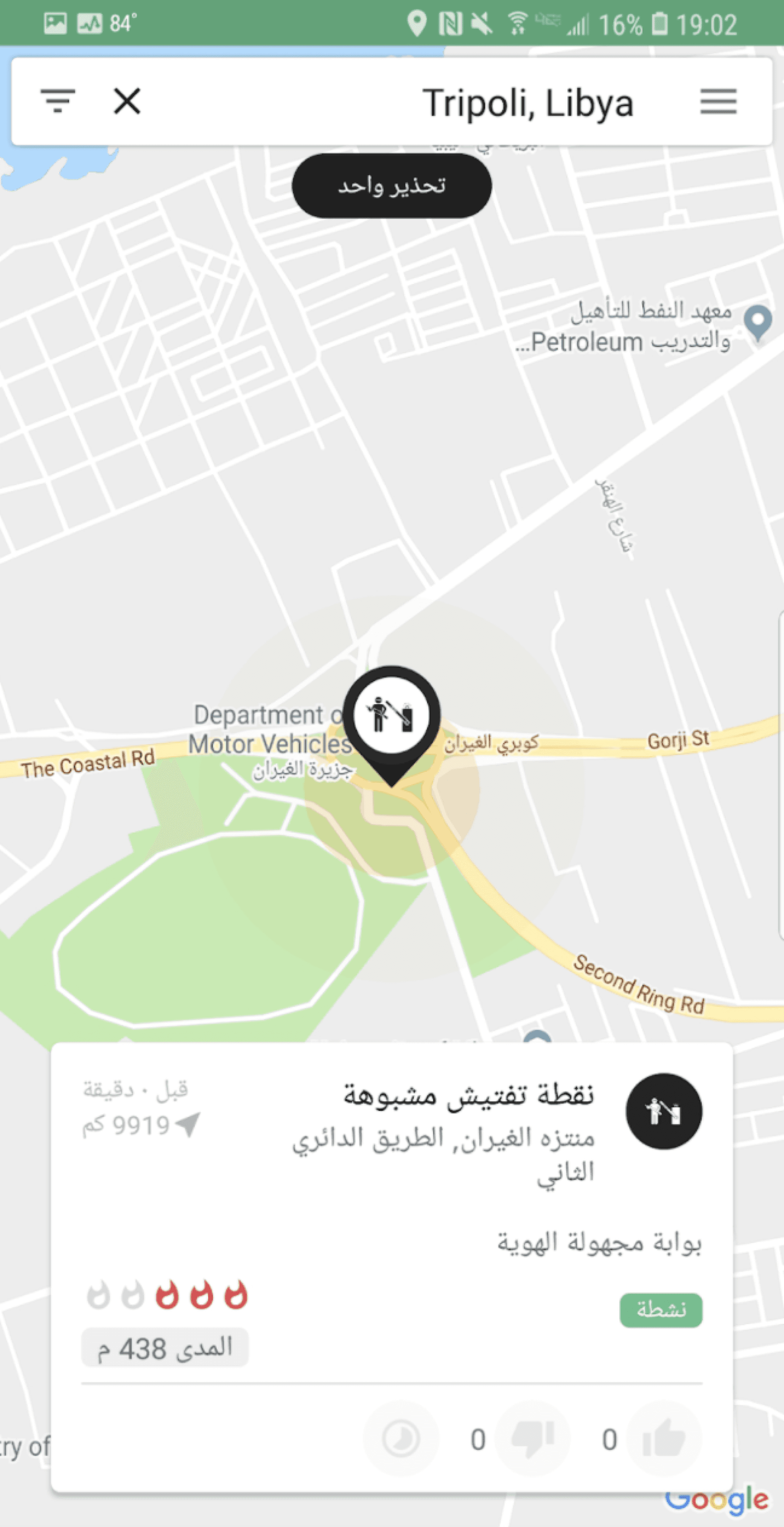
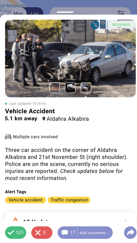
This project was completed by a team of three members, including myself. The main objectives for this project were provided to us by our stakeholders. We were given access to internal documents and a confluence page for reference. Their beta version (shown on the right) was the focus of our project. Here were the goals based on priority:
Priority 1
• User Report Submission Form
• Improving Report Details
Priority 2
• User Report Submission Form
(adding to existing alerts)
• Map Markers/Icons
Priority 3
• UI Visual Revamp
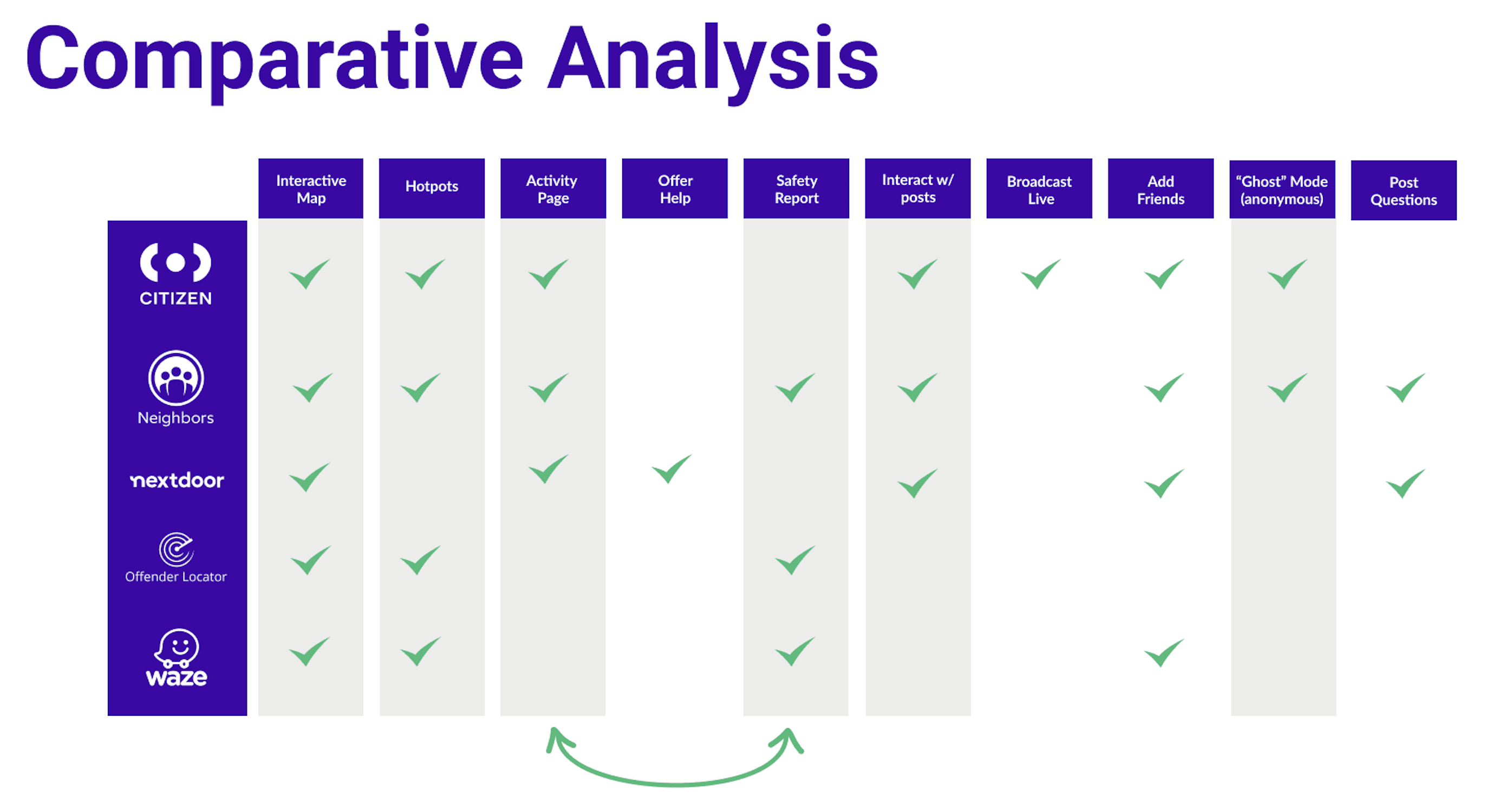
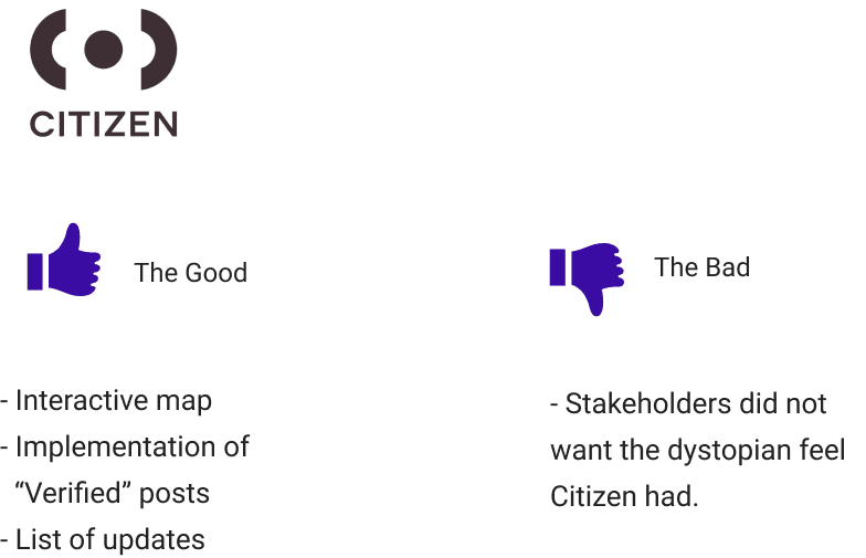
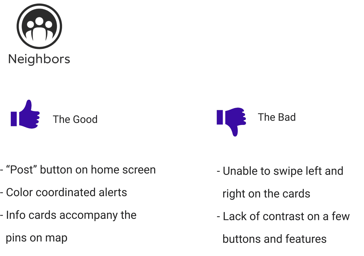
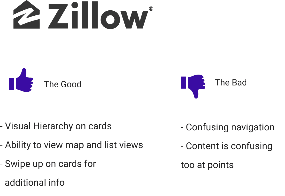
COMPARATIVE ANALYSIS
We didn't really have any direct competitors so we went ahead and performed a comparative analysis, highlighting features we thought would give value to Averto (if not already existing on the beta version). All the features highlighted in grey were implemented in our designs, combining the Activity Page with Safety Report amongst others.
COMPARATIVE ANALYSIS - UI
CARD SORT
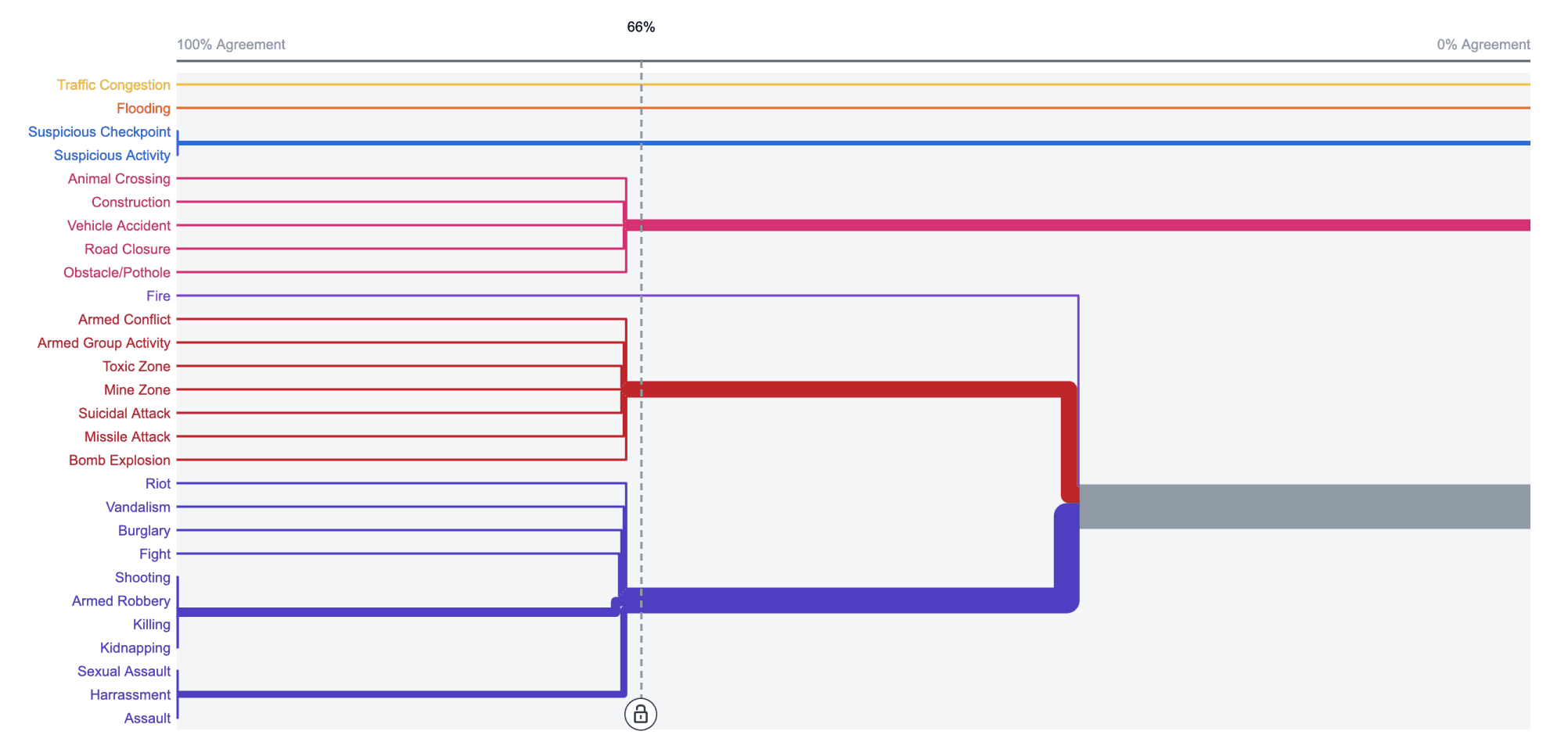
I decided to perform 2 rounds of card sorting to determine how to categorize the various alert types already utilized. It made the most sense performing this activity (users in Libya) with the many alerts that have been previously reported on the app.
USER INTERVIEW INSIGHTS
ON AVERTO
“The Libya situation has many dangerous things going on, so if there is any disturbed events around I use it to check people’s warnings so I can stay safe.”
— INTERVIEW 1
ON SHARING SOCIALLY
“I don’t hear much. I wish to increase the media campaigns.”
- INTERVIEW 2
ON HELPFUL ALERTS
“Sudden problems, like traffic, closed roads and rivulet in the winter..”
— INTERVIEW 3
USER JOURNEY MAP
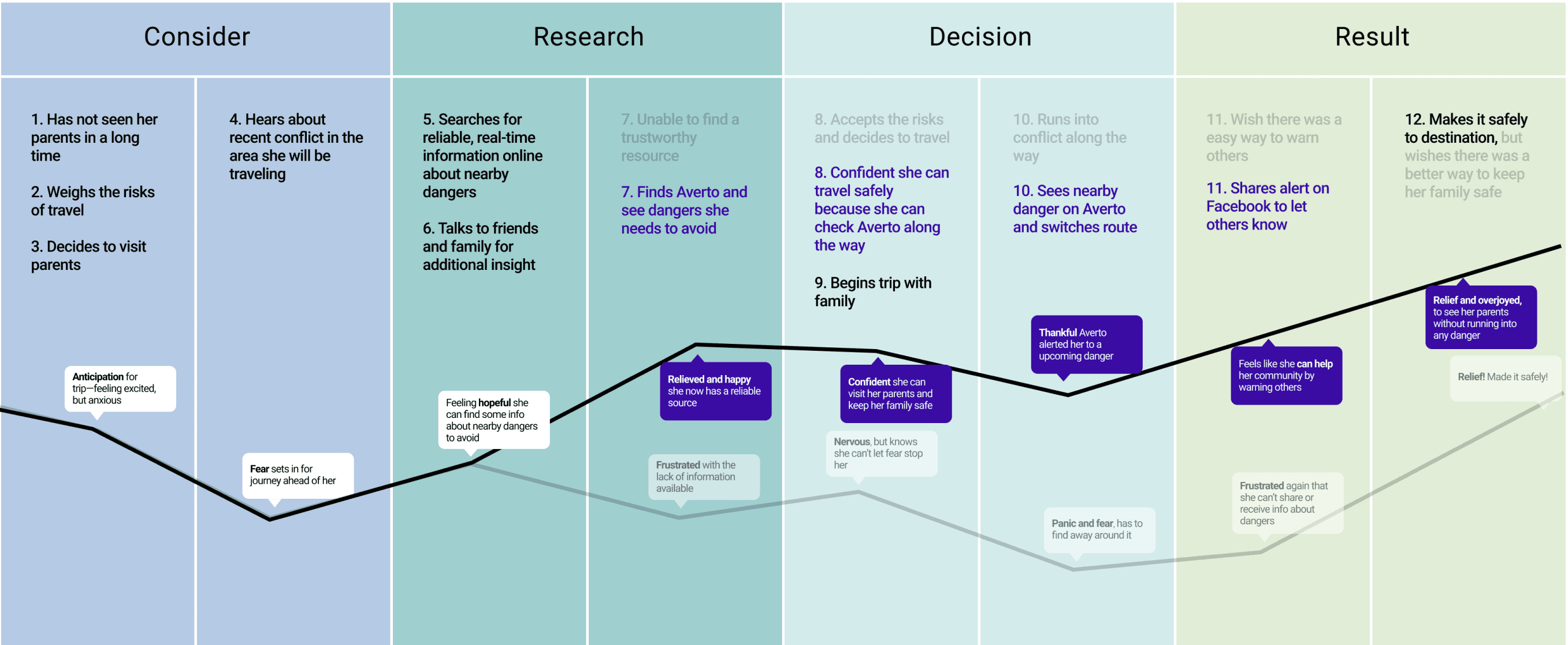
In this journey map, our user would like to visit her family out of town, she wants to be aware of threats along the way, in order to make it safely to her destination. With the use of the Averto app this alleviates pain points along the way.
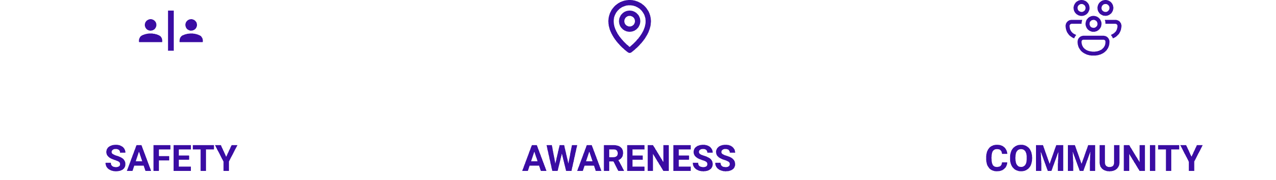
Based on the information gathered from interviews, card sorting and developing a journey map, we came up with three essential core user needs...
CORE USER NEEDS
PERSONA 1
Fatima needs a way to travel safely to and from her family outside of town, whilst having real-time information regarding threats from a trusted community.
— Fatima, Mother of 3
GOALS
- Ability to safely and confidently travel inside and outside of the city
- Easy access to real-time information regarding potential threats
- A community of people she can trust to provide accurate information.
FRUSTRATIONS
- Unable to easily travel around the area without safety concerns
- The unknown of what may be going around in her area or the area she is traveling to
- Information on hazards is hard to find due to no centralized information base

PERSONA 2
Amir needs a quick and efficient way to report any potential threats that will be shared, to keep his community notified and allow them to avoid and keep safe.
— Amir, Successful Businessman
GOALS
- A quick way to report hazards/information he sees within his community
- Give credible updates on ongoing incidents he sees
- Easily share information of hazards/information to social media
FRUSTRATIONS
- Unable to help protect his local community like he would like to
- Information on hazards/incidents can get lost on social media and sometimes aren’t credible
- Lack of centralized, crowdsourced information available to the community

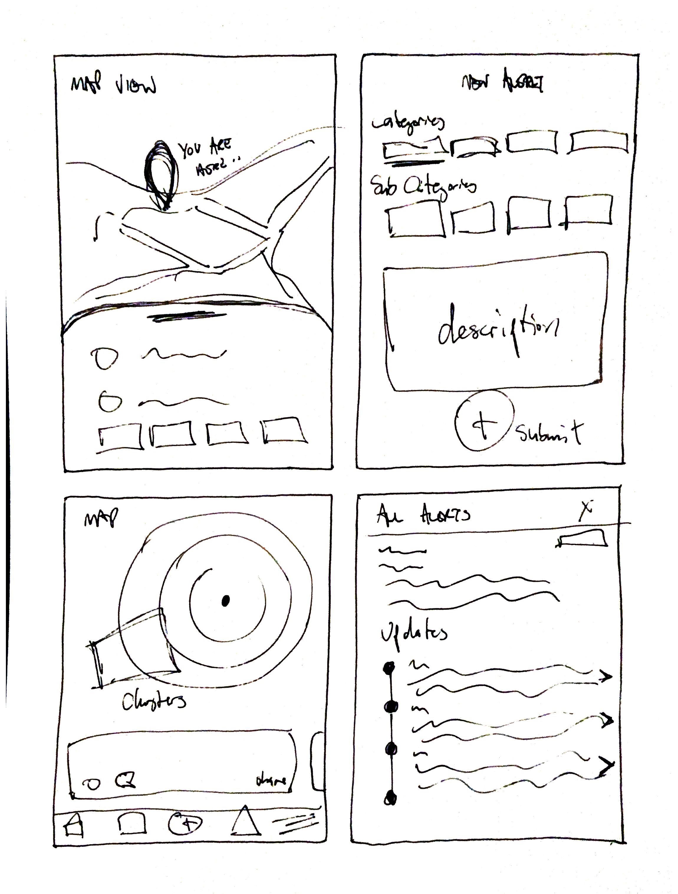
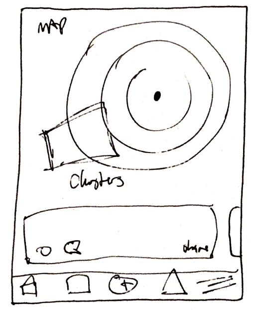
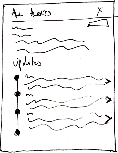
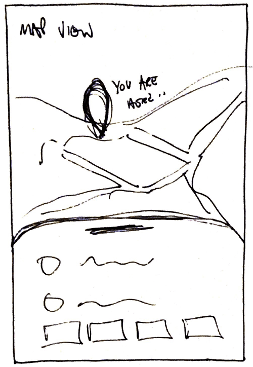
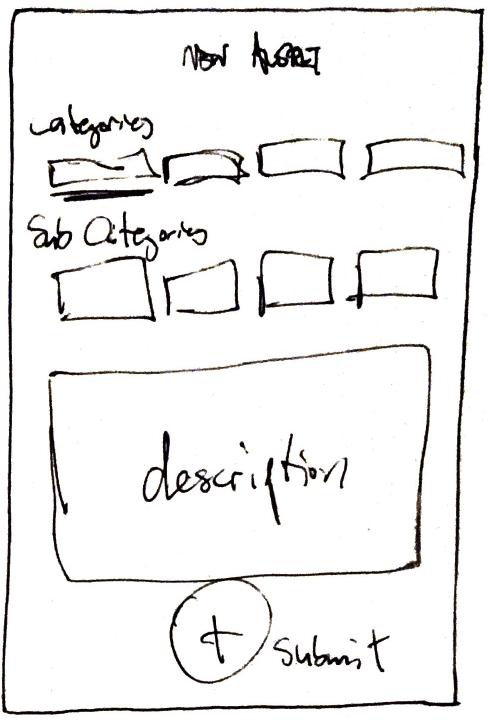
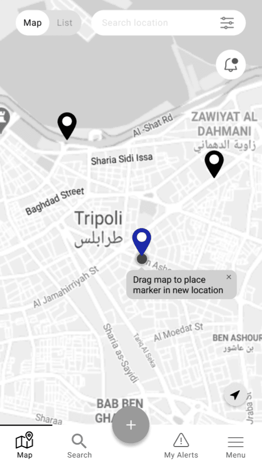
LO-FI WIREFRAMES
TESTING ITERATIONS
TESTING FEEDBACK PHASE 1
“How do you get back?” “Want to submit to be at the bottom” “Accidentally clicked on pic to get more info, didn’t know to do that.”
ITERATIONS AFTER PHASE 1
- Navigation improvements -We neglected the importance of a "back" button early on. - CTA button positioning
TESTING FEEDBACK PHASE 2
“Would like to add a specific time”
“It’s not immediately obvious where updates are”
“Unsure if metadata view expanded further”
ITERATIONS AFTER PHASE 2
- Scrollable time option
We received feedback on how important the time of the incident was.
- Copy changes and pop up with tips to guide the user
- Informational onboarding screens
TESTING FEEDBACK PHASE 3
“Bottom buttons feel small in the metadata and report view”
“How do I change the location of an alert?”
ITERATIONS AFTER PHASE 3
- Improve sizing throughout
- Add a dragging feature with a pop-up for further instructions
REFLECTION & THOUGHTS
This was a very enlightening and fun project with communicative, supportive stakeholders. They were pleased with what we had accomplished with the UI overhaul as well as the insights we delivered.
The research and synthesis portion were in my opinion the pillars of why this sprint was a success. Some information was provided from Averto's last iteration but we unraveled the core user needs from the depths of our interviews and qualitative debriefing. It was illuminating to myself and the Averto team how transparent the interviewees were. Their willingness to test our prototypes was incredibly encouraging.
Despite meeting our requirements within the 3 week sprint, I feel as though there is more to explore in the improvement and overhaul of this app.